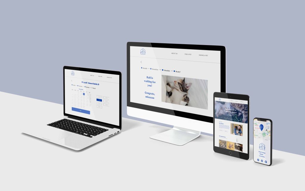
Case Study — Pet Adoption App and website
#AdoptATreasure
App and website to help find adoption families for dogs & cats.
The product:
#AdoptATreasure is a website designed to support a specific shelter to help animals
get adopted faster
Responsabilities:
Conducting interviews, paper and digital wireframing, low and high-fidelity prototyping, conducting usability studies, accounting for accessibility, iterating on designs, determining information architecture, and responsive design.
My role:
UX and UI designer, defining flows as well as leading the design of the app’s and website’s presence from conception to delivery.
The problem:
It’s hard for users to find a website where you can search and filter pets with their details (dog / cat, sex, age, size). The main problem is to make people aware not to buy, but to adopt.
The Goal:
Create a website where you can choose a pet to visit and adopt, also you can donate to help the shelter manage caring animals.
The better the pictures are, the more “appealing” the animals become, it’s sad but a lot of people care about the beauty of their animals.
Duration:
February — March 2022
Target Audience
As the project is for social good, the website and app’s main target audience is the general community — helping save family, friends and neighbours’ lives.
Example Persona
Josie Vergara
As a pet shelter owner, I would love to find homes & families for all these abandoned animals, so they can have a new happy life.
Age: 22
Education: Masters Degree
Hometown: Porto, Portugal
Family: Boyfriend, 1 dog
Occupation: Graphic designer, and pet shelter owner
Goals
- Make the adoption process easier;
- Show all the pets for adoption in a beautiful way;
- Be sure that is the right family for pets;
- After adoption be sure that they are ok.
Frustrations
- People who don’t understand that animals have to stay with their mother for a few months until they are adopted;
- Want to choose animal colors;
- Want animals to offer their children, nephews etc.
User research: summary
Although I had some knowledge prior to initiating this journey, I took that aside and conducted interviews and created empathy maps to understand the users I’m designing for and their needs. A primary user group identified through research was future adoption families that want to both be able to understand what are the pets available to adopt as well as pick one for adoption (having in mind their characteristics). Another group I identified was pet shelter owners, where the website will help them financially through donations and the biggest goal find a family for the animals.
Ideation
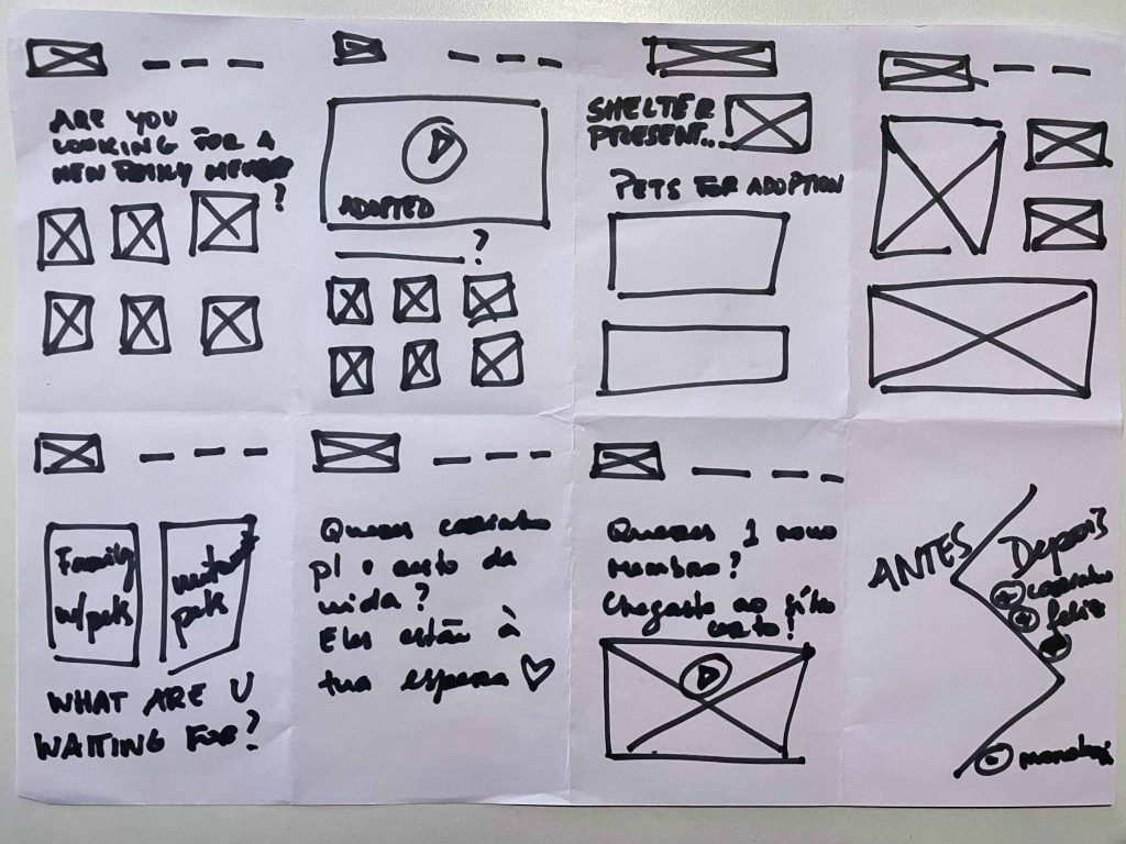
I started to a quick ideation exercise called Crazy Eights to come up with out of the box ideas to create lo-fi prototypes and finally test with the users.
Key Challenges and Constrains
1. App as medium
Having a mobile app as the medium to deliver content has both advantages and disadvantages. Here I had to be mindful of the constrains of accessing and planning information “on the go” vs. on a computer where maybe you get more real estate to show options and additional information.
2. Non-Tech Literate Audience
Although many people who want to adopt will have enough tech literacy that they can use the app and some of the more advanced features without much problem, I had to take into account lower levels of tech literacy from family members.
3. Simple, But Complete
Mixing having an app that is both simple and complete was / is sometimes a tough challenge. Here I had to be specially careful to ensure that although I was trying to simplify the experience I wouldn’t deprive the app from some of it’s essential content.
User research: pain points
1. Buy VS Adoption
A sad point: Animals for adoption are usually not as “pretty” as those for sale.
2. Characteristics
Pets could not be filter in the most adoption platforms.
3. Schedule
Families who want to adopt a new pet could not to meet in person a specific animal
4. Accessibility
Adoption platforms are not equipped with accessible technologies
Wireframing the Experience
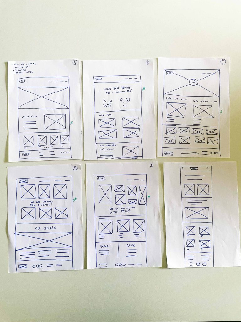
Taking the time to draft iterations of each screen of the app on paper ensured that the elements that made it to digital wireframes. It also made it easier to iterate quickly on those initial wireframes.
As I moved the paper wireframes to digital versions, I made sure to further refine these and make sure they met accessibility standards as well as ended up representing the useful product I wanted to build for users.
Easy navigation was a key user need to address in the wireframing in addition to equipping the app to work with assistive and accessible technologies.
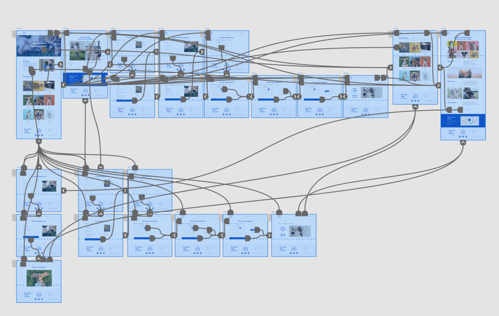
Initial Design Concepts — Site Map
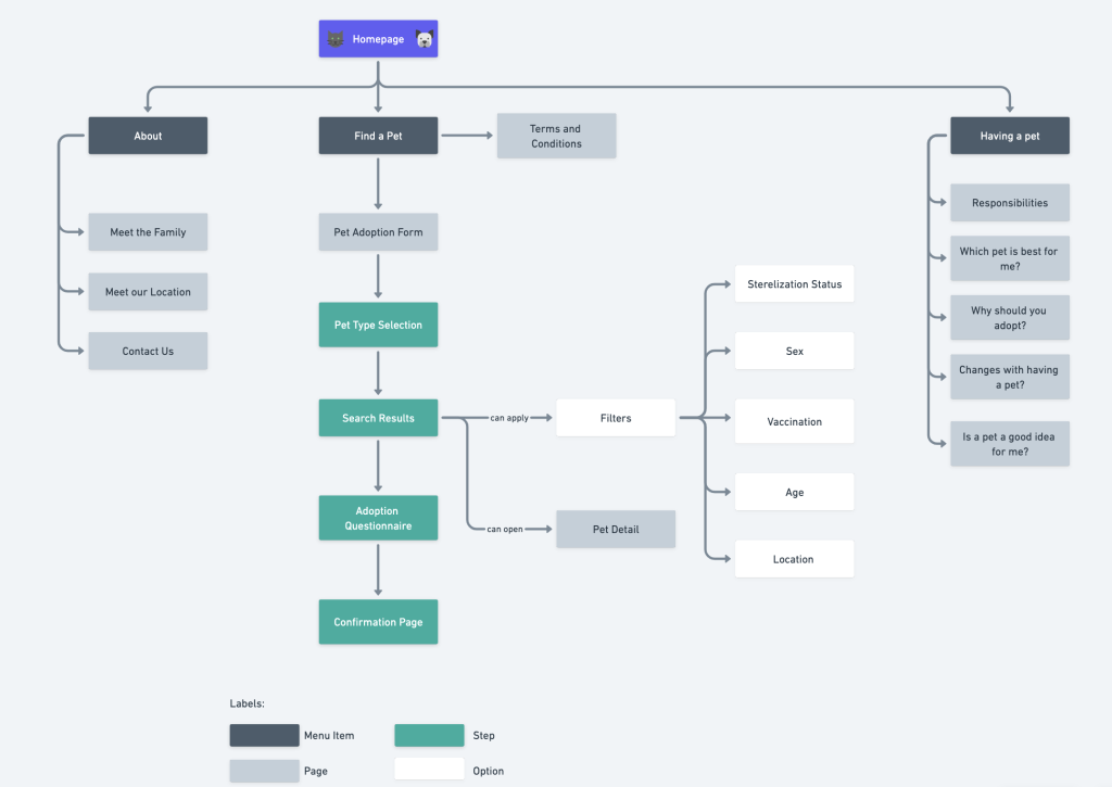
The website, like the app, is supposed to be simple and straightforward. We want to guide people through the adoption importance and adoption flow. It’s a guided navigation interface. At the same time, we want to make sure critical pieces (such as how to adopt) are easily accessible.
User Tests
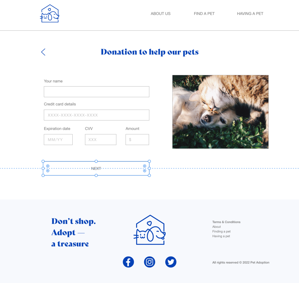
Given users’ feedback, to simplify and better navigate on the adoption and donation flow I put the button above the fold.

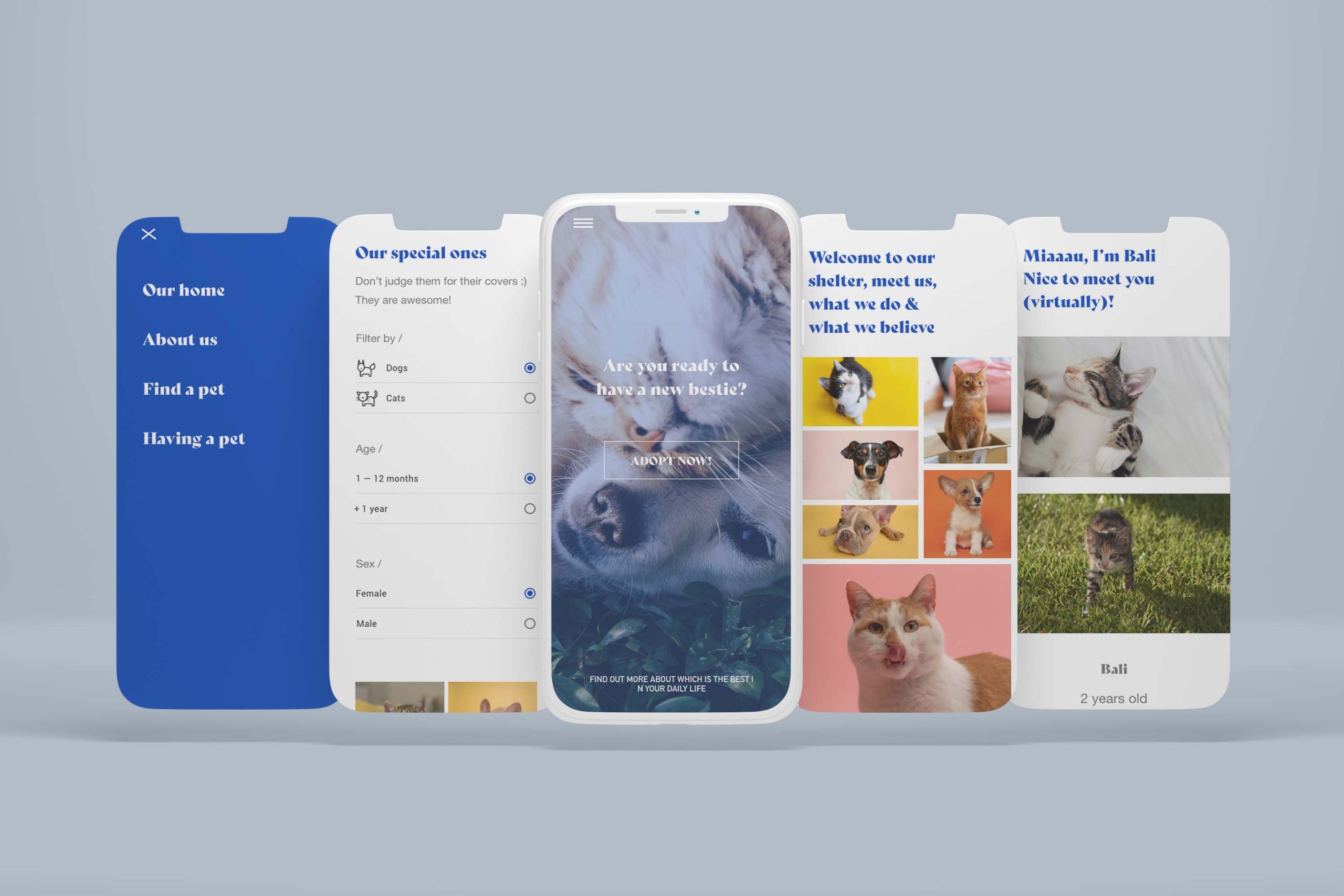
Mockups and Prototype
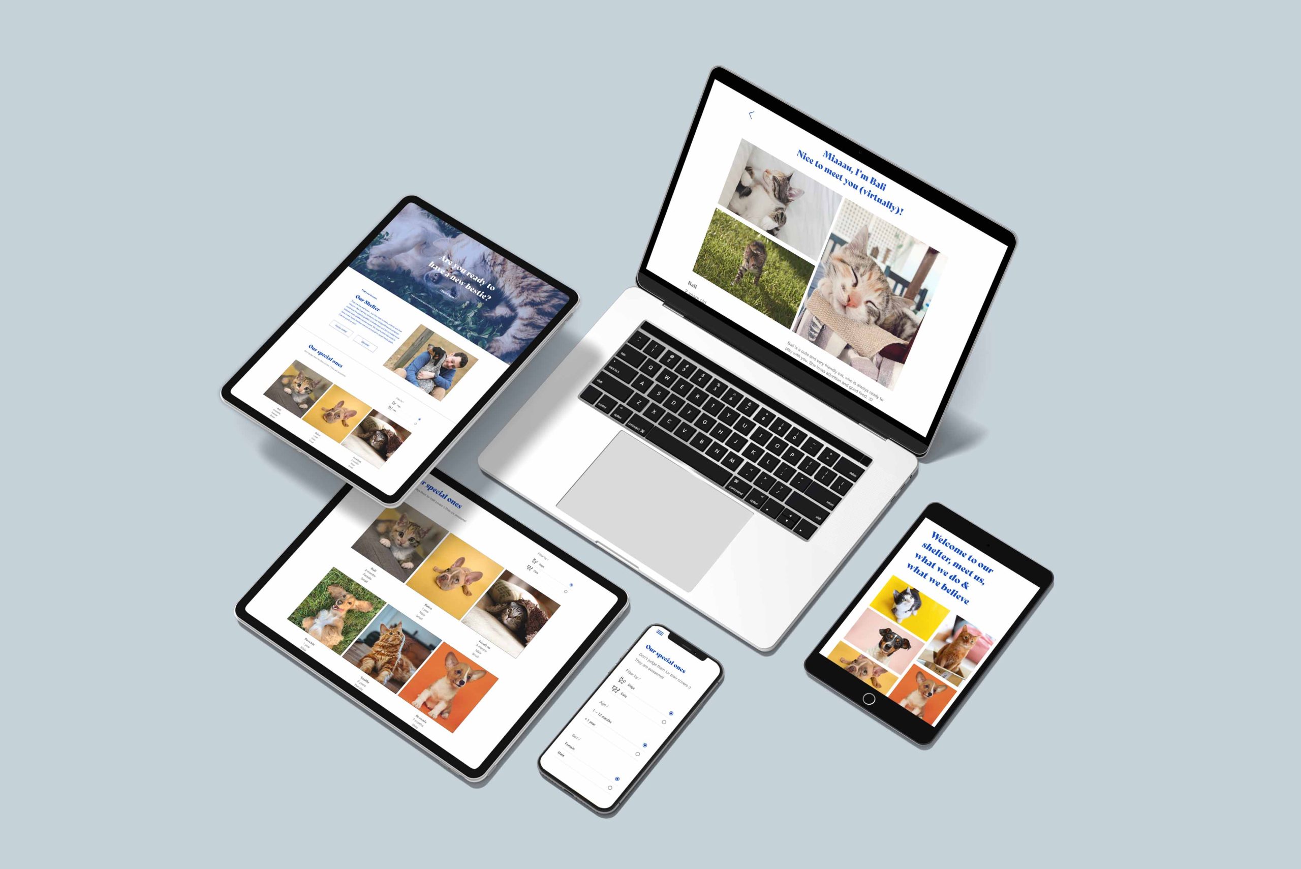
After adjustments to the screen design based on user feedback, I ended up creating a high-fidelity prototype that was changed a bunch of times until it presented cleaner user flows emergency situations. This final prototype tried to simulate the yet-to-be-built website with the appropriate flows, actions and navigation, further enhancing the experience of those trying the website and in the future improving the handoff to engineering.
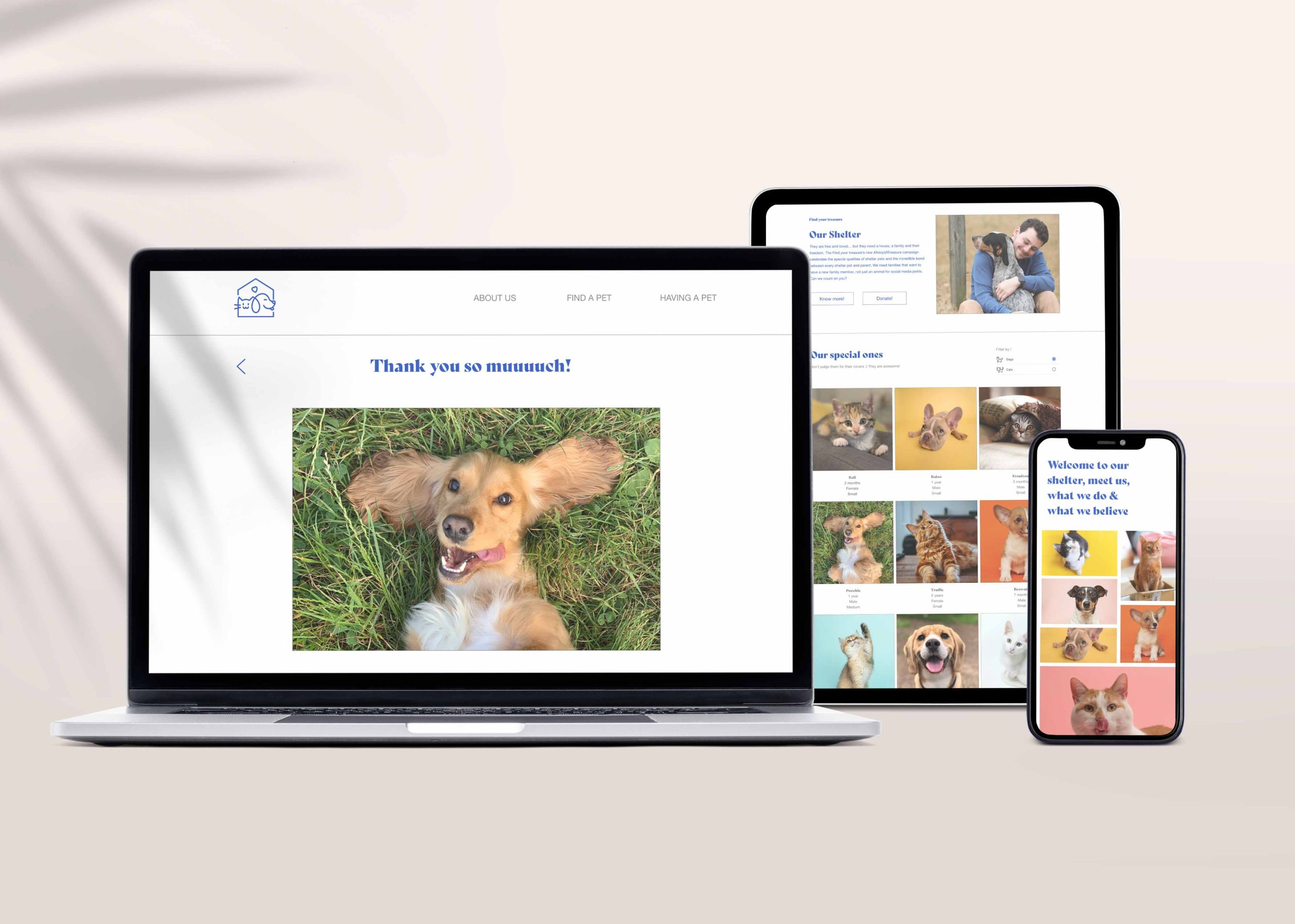
Responsive Design
The entire set of screens was thought to be responsive, with information adapted to each screen type not only in design but also taking into consideration the needs and the hopeful use-cases of users in each of the platforms.
Conclusion
Impact:
A think the bigger impact is the fact that can help abandoned animals to be adopted in a faster way, given the design simplicity and the font and center user design thinking.
What I learned:
While designing the #AdoptATreasure I understood that sometimes steps that were unnecessary for certain users, is a must for others, so we can never “assume” what is the best — we always need to do usability studies to improve our project.
