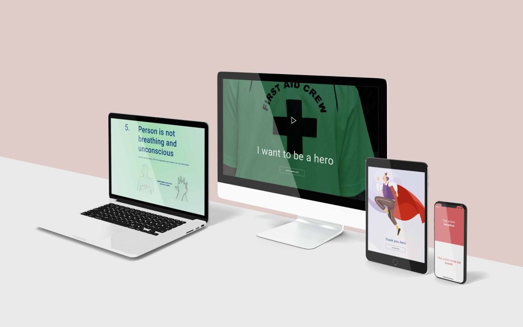
Case Study — CPR app and website
Be the Next Hero
App and website to help people save lives, teaching CPR and how to act in an emergency situation step by step.
The product:
“Be The Next Hero” is a mix between an app and a website that provide people in the community with knowledge about the importance of CPR as a way to save lives as well as step-by-step instructions on how to perform it if needed.
Responsabilities:
Conducting interviews, paper and digital wireframing, low and high-fidelity prototyping, conducting usability studies, accounting for accessibility, iterating on designs, determining information architecture, and responsive design.
My role:
UX and UI designer, defining flows as well as leading the design of the app’s and website’s presence from conception to delivery.
The problem:
70 percent of Americans may feel helpless to act during a cardiac emergency because they either do not know how to administer CPR or their training has significantly lapsed. This alarming statistic could hit close to home, because home is exactly where 88 percent of cardiac arrests occur.
The Goal:
Making society aware of how to act during an emergency situation is the biggest challenge and goal. Given properly and immediately to sudden cardiac arrest victims, CPR can save lives.
Duration:
1 month (April 2022)
Target Audience
As the project is for social good, the website and app’s main target audience is the general community — helping save family, friends and neighbours’ lives.
Example Persona

Carolina Fernandez
Carolina is a volunteer dealing with sick children and ER doctor daughter who needs to learn how to deal cardiorespiratory arrests because she loves to help others.
Age: 22
Education:Architecture student
Hometown: Lisbon, Portugal
Family: Parents, 1 dog, 1 cat
Occupation: Student
Goals
- Recognize what to do in a crisis situation
- Being able to act autonomously
- Sensitize friends to help others
Frustrations
- Not knowing what to do/how to help
- Not having any tool / app that can help you in an extreme situation
User research: summary
We’re creating a new app to help people save lives, teaching CPR and how to act in an emergency situation step by step. We need to find out if the main user experience — learning CPR and act — is easy for users. We would also like to understand specific challenges that users might face in the learning and acting process (hands on). This is the first research to be completed for this project.
Ideation
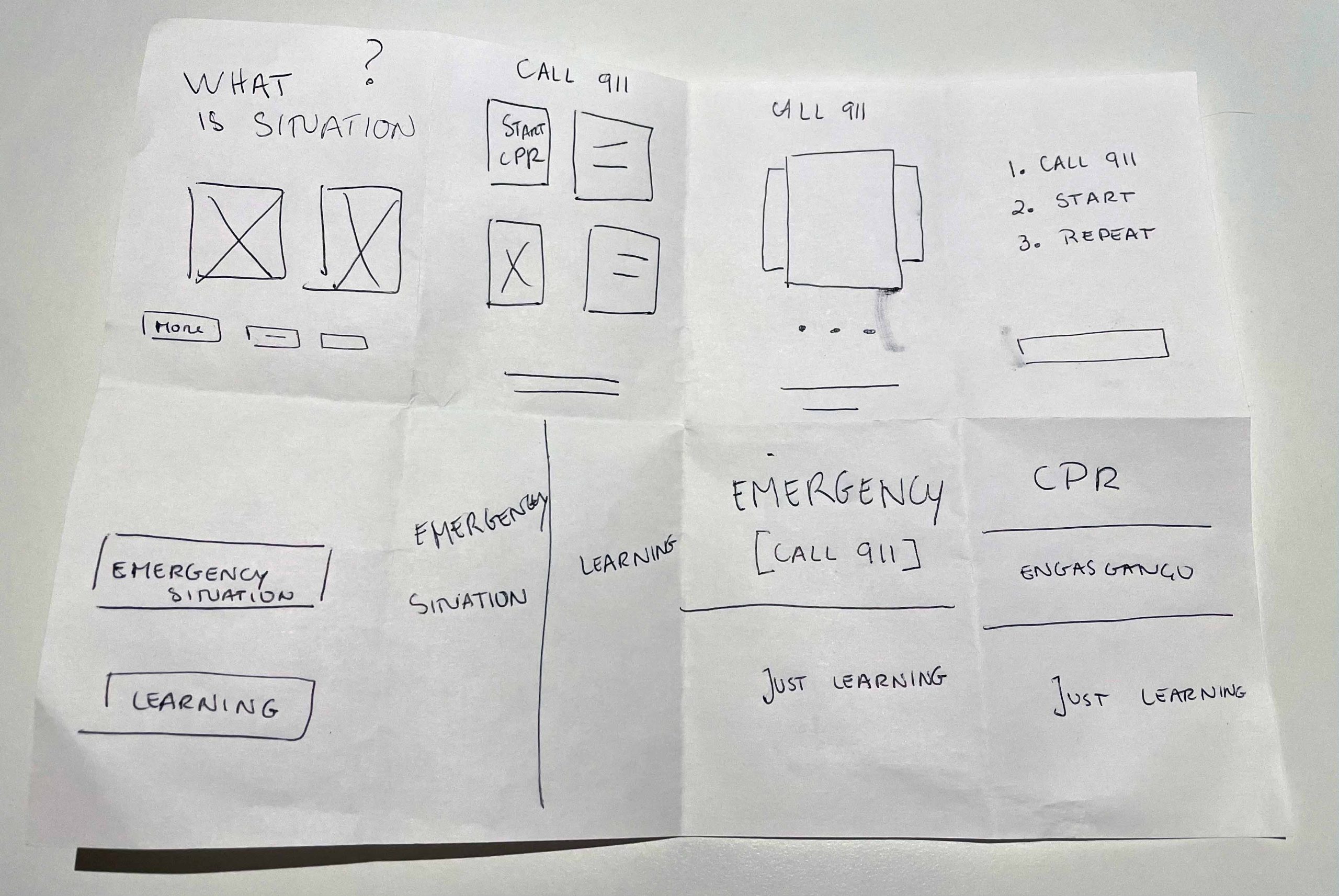
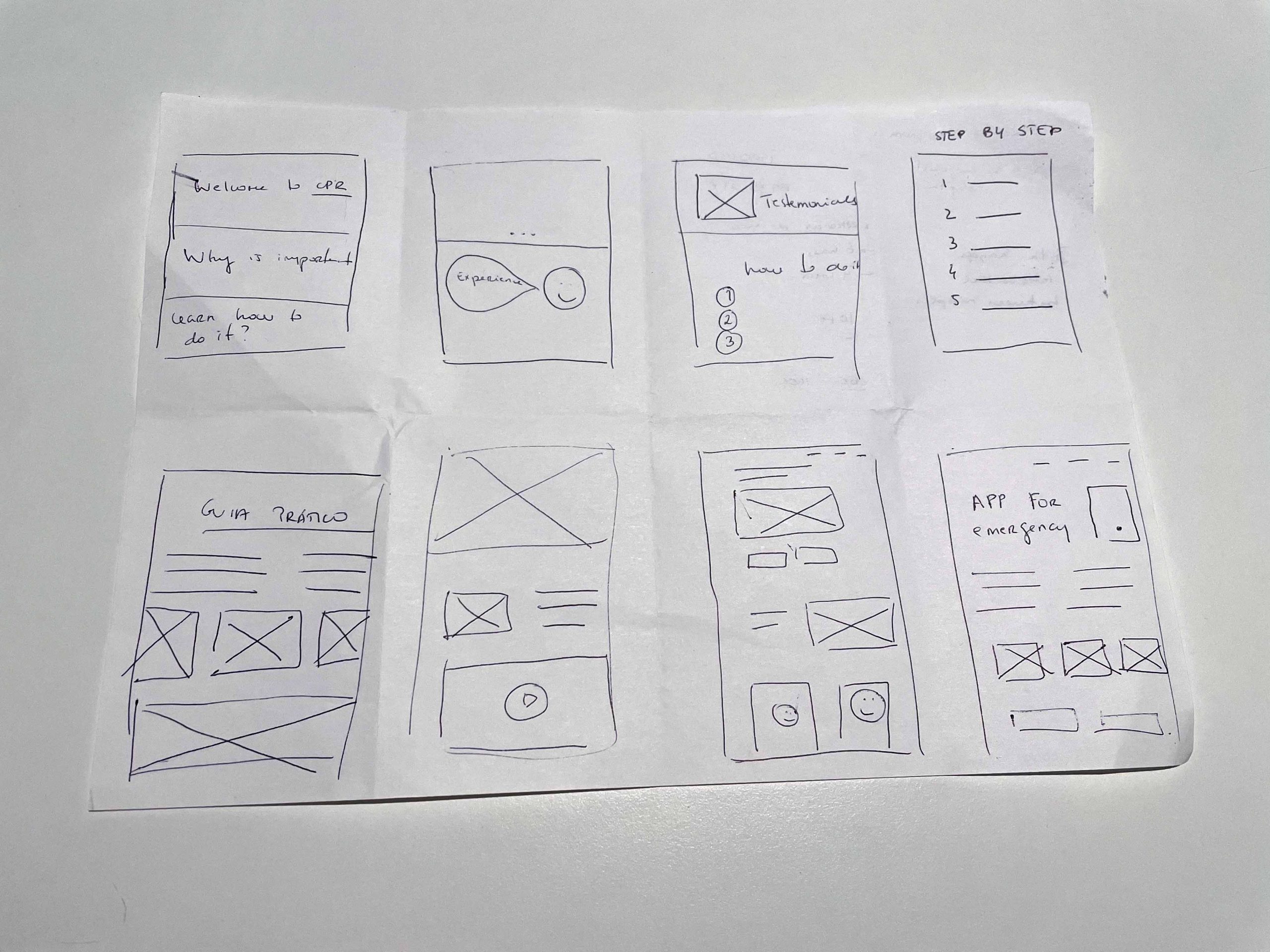
I did a quick ideation exercise called Crazy Eights to come up with out of the box ideas to create lo-fi prototypes and finally test with the users.
Key Challenges and Constrains
1. App as medium
Having a mobile app as the medium to deliver content has both advantages and disadvantages. Here I had to be mindful of the constrains of accessing and planning information “on the go” vs. on a computer where maybe you get more real estate to show options and additional information.
2. Non-Tech Literate Audience
Although main community will have enough tech literacy that they can use the app and some of the more advanced features without much problem, I had to take into account lower levels of tech literacy from older people who might to use the app in an emergency situation.
3. Simple, But Complete
Mixing having an app that is both simple and complete was / is sometimes a tough challenge. Here I had to be specially careful to ensure that although I was trying to simplify the experience I wouldn’t deprive the app from some of it’s essential content.
Wireframing the Experience
Taking the time to draft iterations of each screen of the app on paper ensured that the elements that made it to digital wireframes. It also made it easier to iterate quickly on those initial wireframes.
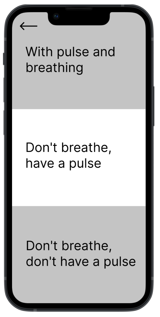
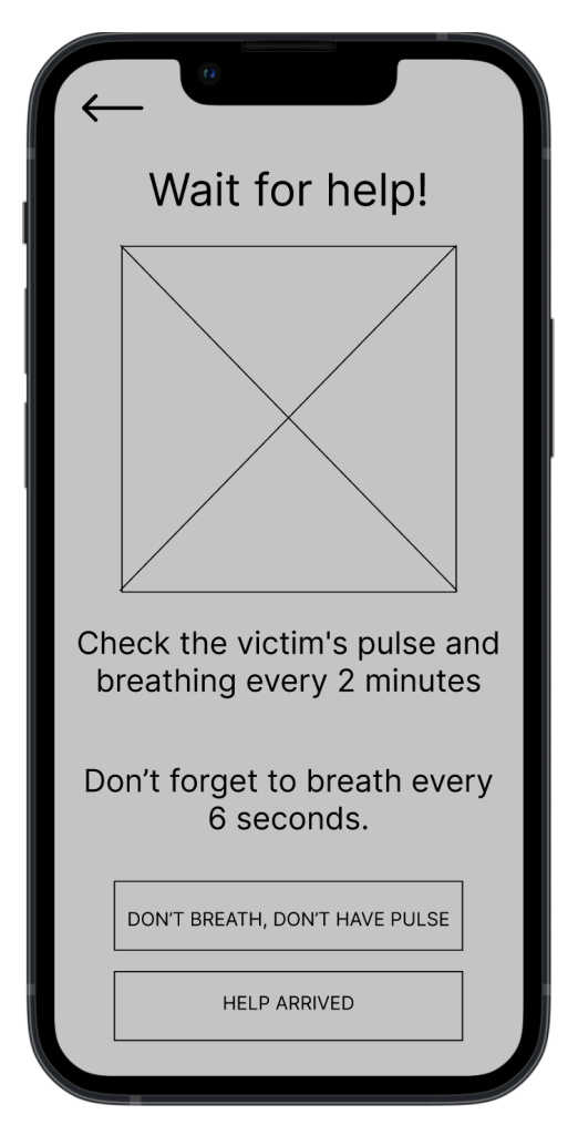
As I moved the paper wireframes to digital versions, I made sure to further refine these and make sure they met accessibility standards as well as ended up representing the useful product I wanted to build for users.
Easy navigation was a key user need to address in the wireframing in addition to equipping the app to work with assistive and accessible technologies.
Adjusting the text makes easy to interact in an emergency situation.
Usability study: findings
1.
Mobile version of the website had to be more action-oriented. People provided feedback that while on the mobile version of the website they might want to jump directly to guidance on performing CPR as default action.
2.
App needed to cater for color-blind people. Initially the app wasn’t designed taking into consideration the needs of those color-blind. Adaptations were made to it to make sure legibility and access to critical information was always considered.
3.
Low network feasibility. The goal of the app is to be used in multiple contexts, mostly “out of their own homes”, thus more than one user suggested the app should be able to load content quickly and rely mostly on text content to provide critical information even when images are not loaded due to network errors of all sorts.
Initial Design Concepts — Site Map
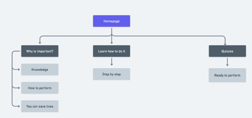
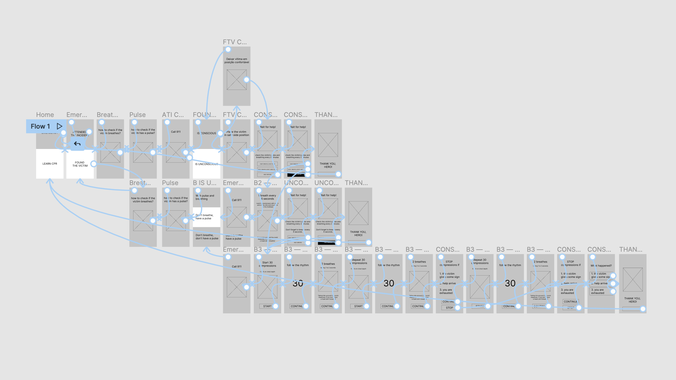
The website, like the app, is supposed to and designed to be simple and straightforward. We want to guide people through the important and history of CPR, how to do it and then provide them quizzes that help them practice it. It’s a guided navigation interface. At the same time, we want to make sure critical pieces (such as learning how to do it) are easily accessible.
User Tests
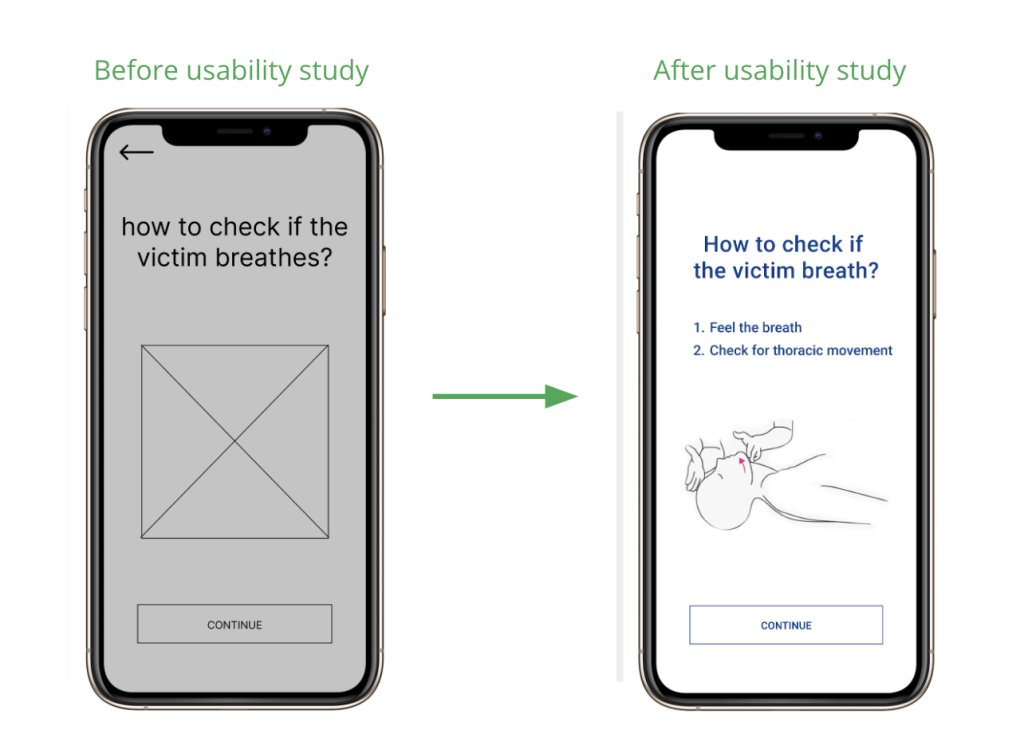
Given many unanswered questions around how to check the breath, I added further detail in text on how to do it.
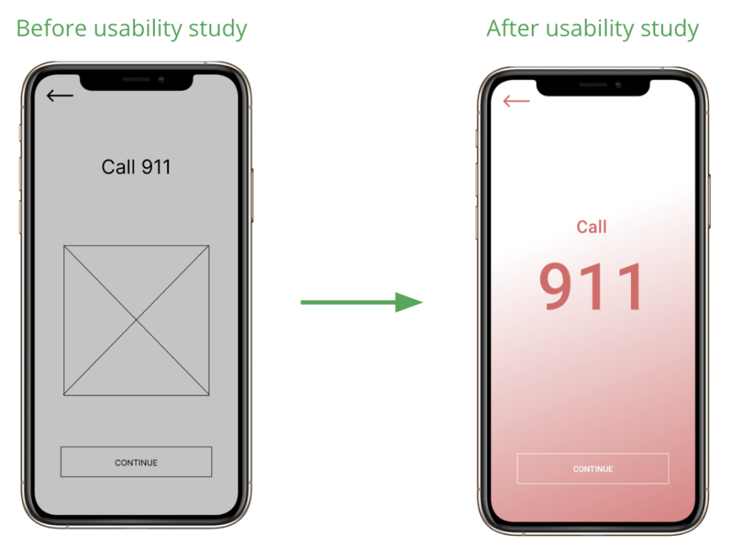
Given that calling 911 is the most important action on this screen I’ve decided, after getting feedback, to remove imagery, increase size of 911 and make it click-to-call so people can more easily place calls.
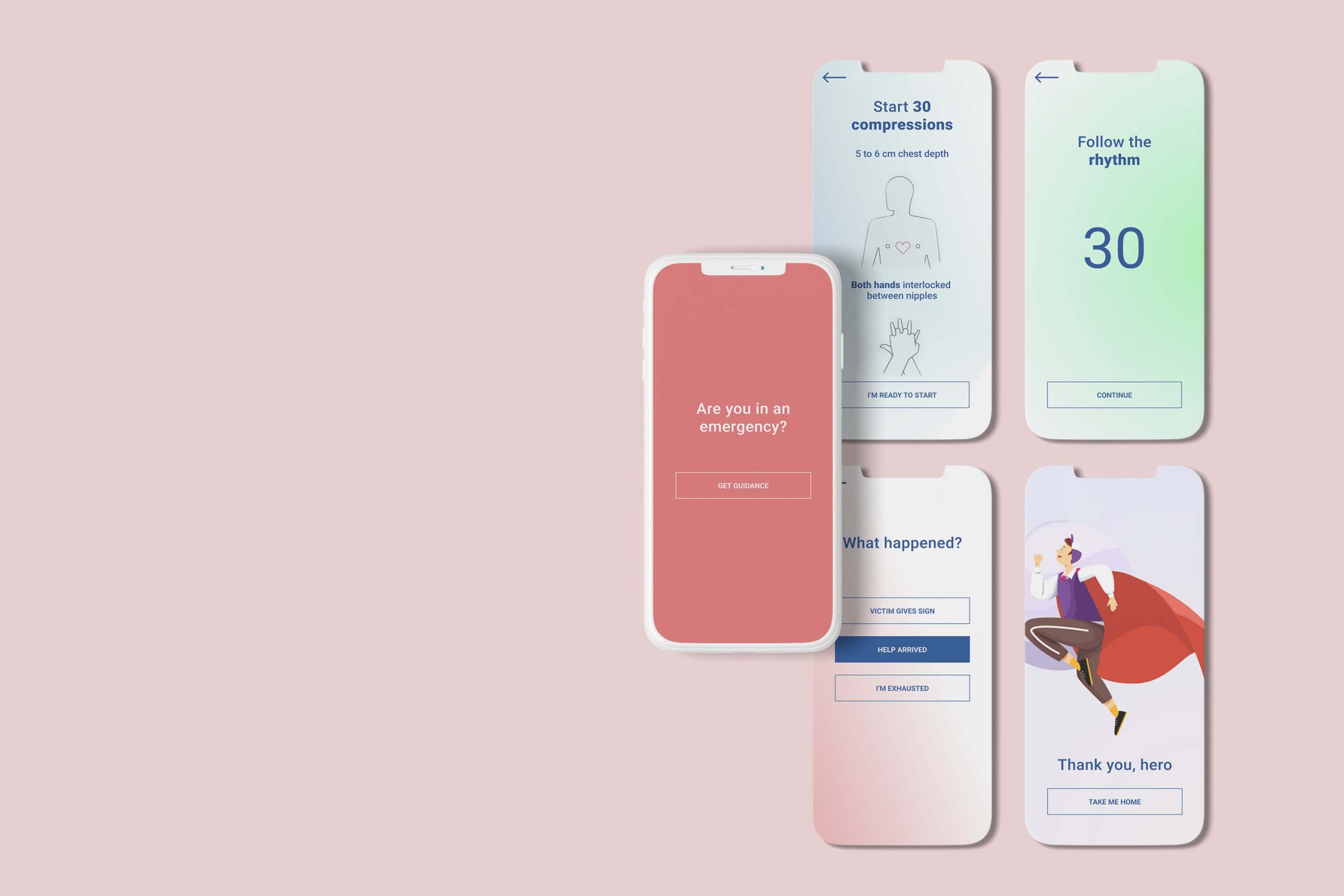
Mockups and Prototype
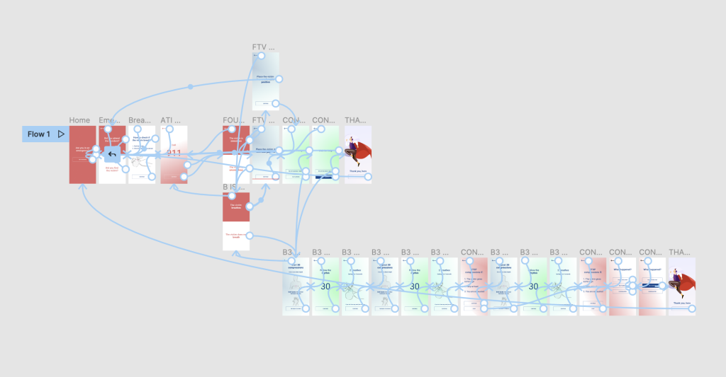
After adjustments to the screen design based on user feedback, I ended up creating a high-fidelity prototype that was changed a bunch of times until it presented cleaner user flows emergency situations. This final prototype tried to simulate the yet-to-be-built app with the appropriate flows, actions and navigation, further enhancing the experience of those trying the app and in the future improving the handoff to engineering.
Responsive Design
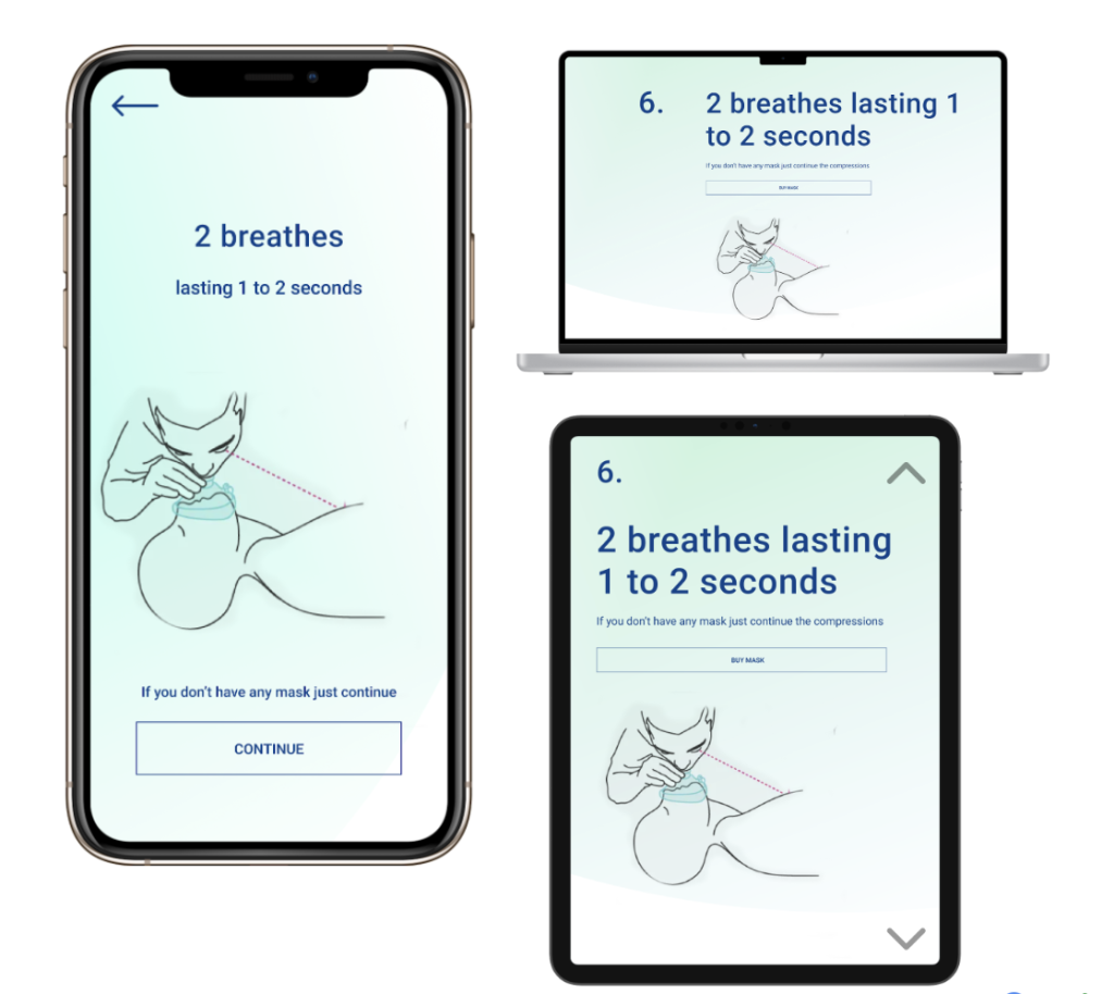
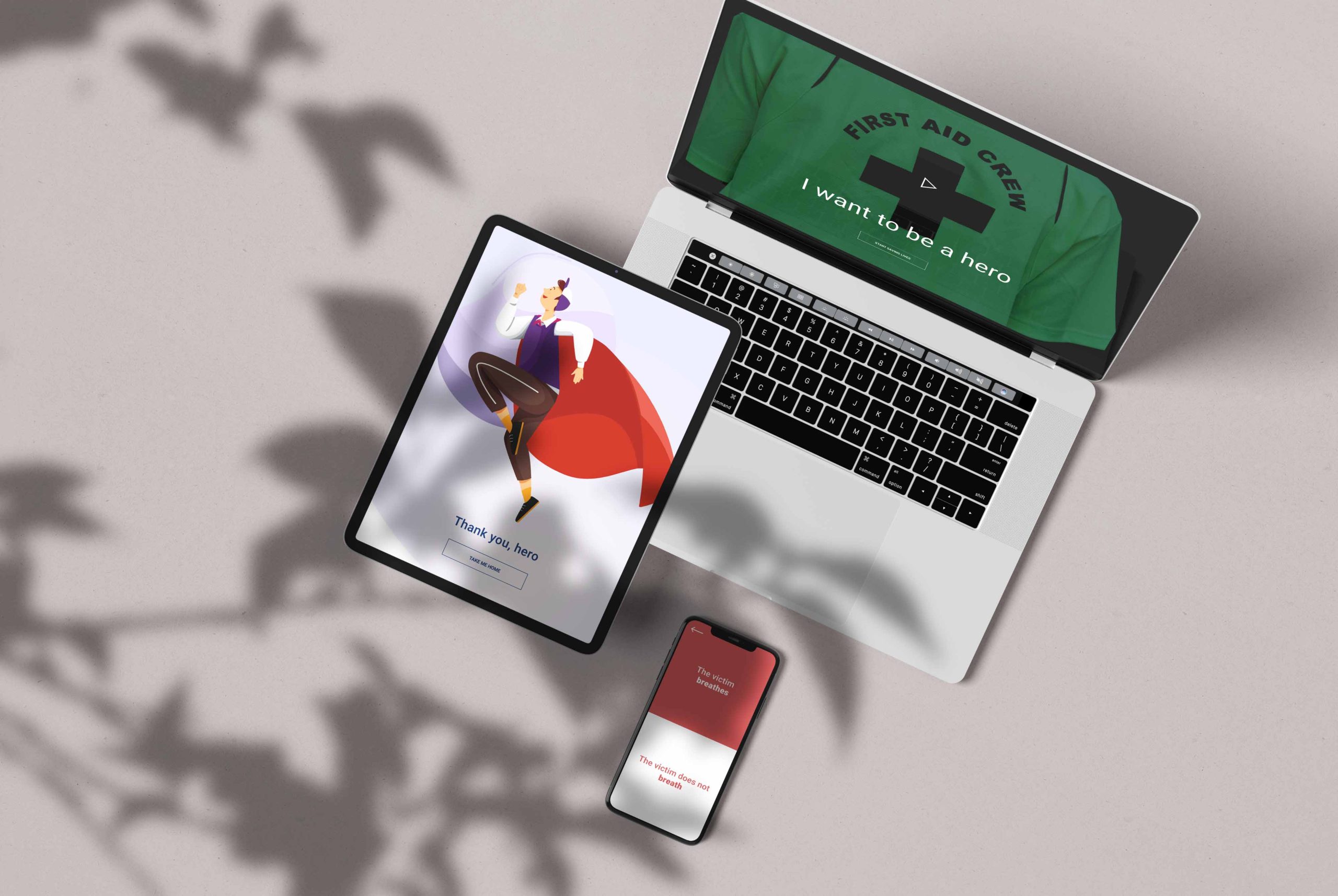
The entire set of screens was thought to be responsive, with information adapted to each screen type not only in design but also taking into consideration the needs and the hopeful use-cases of users in each of the platforms.
Conclusion
Impact:
A think the bigger impact is the fact it definitely help to save lives if someone need to perform CPR. Users just follow the steps and you will be able to save a life. One quote from a test user that made me really happy “The app I would never delete!”
What I learned:
While designing the Be the Next Hero app/website, I learned that what seems “simple and direct for me”, sometime is not.
I built the project through my mentor and user feedback, which gives me a “guarantee” that the app will be useful and above all help save lives.
