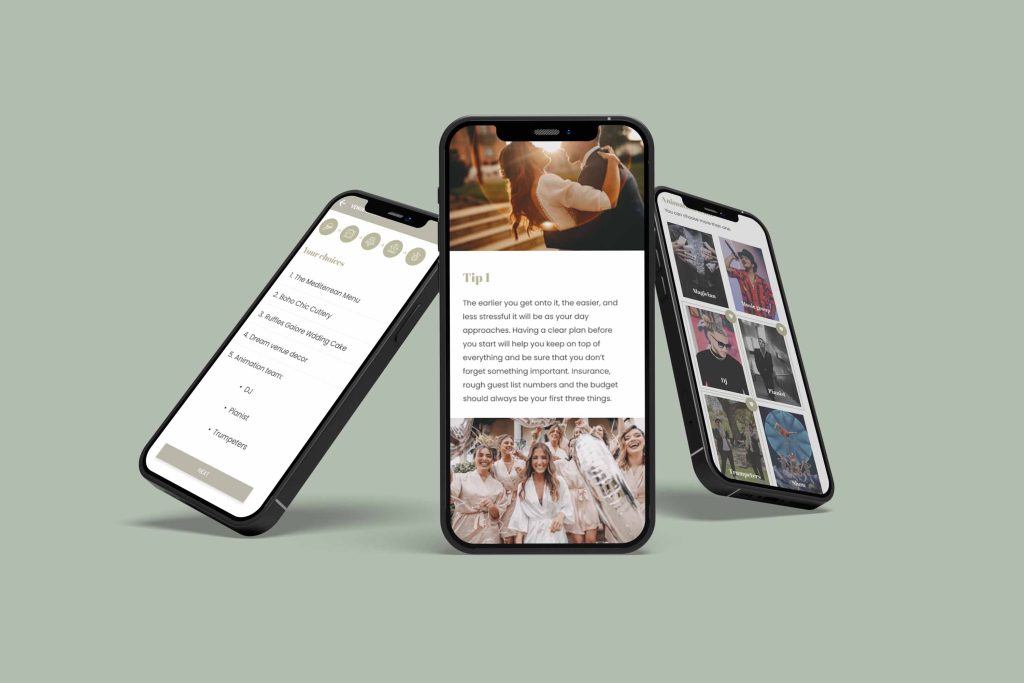
Case Study — Wedding App
“Designing an app for a wedding venue”
Creating a new experience for a wedding venue that allows brides, grooms and families to plan the big day from A to Z.
The product:
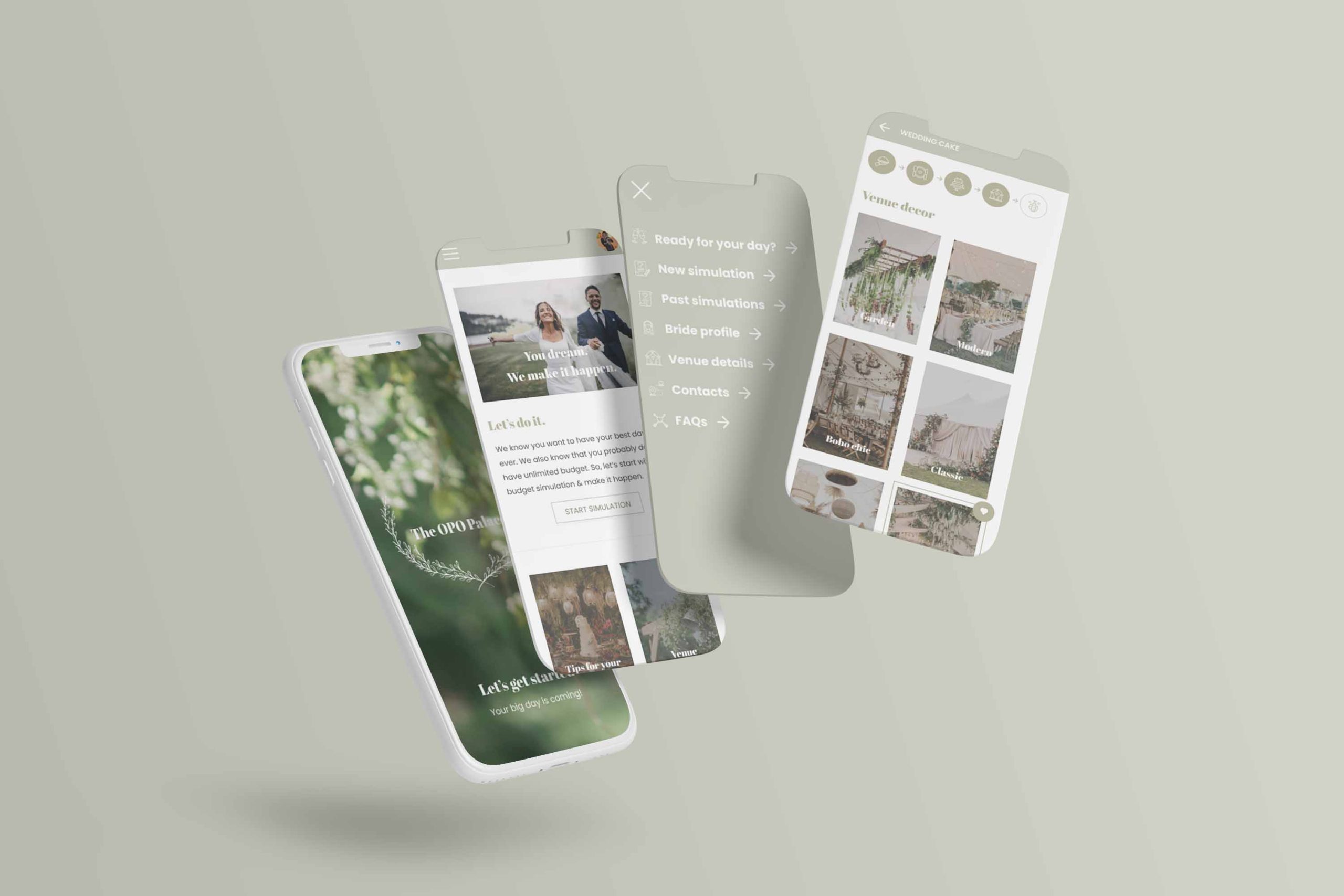
OPO Palace is an app designed to support a specific wedding venue help future brides, grooms and their families project and choose all the details for their big day in that venue.
Responsabilities:
Conducting interviews, paper and digital wireframing, low and high-fidelity prototyping, conducting usability studies, accounting for accessibility, designing and iterating on designs.
My role:
Joana Castro Santos, UX designer
— designing an app for OPO Palace from conception to delivery.
The problem:
It’s hard for users to both find a suitable wedding venue as well as to understand what are the options and underlying costs for the specifics of a wedding day.
The Goal:
Create an app where you can pick all the details (including menu, decor, cake) and get a simulated budget and availability.
Duration:
September 2021 — January 2022
Target Audience
The app’s main target audience are brides and grooms planning their big day as well as their families. A secondary ‘audience’ ends up also being the event planners (who have to interact with the app to provide details for grooms/brides to consume) as well as other venue administrators.
Example Persona

Alex Jacquier
Ambitious associate at a law first who wants the perfect wedding venue, without spending a lot of time, with the help of an efficient app or website to choose all the details and do a financial simulation.
Education: Masters in Law Practice
Hometown: Paris, France
Family: Boyfriends, 2 dogs
Occupation: Associate in a Law Firm
Goals
- To be sure of financials and all the details before visiting a wedding venue
- Possibility to simulate a price for X persons with menu / decorations / DJ and all other extras…
- The dream venue accept LGBT couples
Frustrations
- Can’t find the right venue with all the characteristics we want and needs
- Waste of time visiting wedding venues
- Can’t simulate each detail on an app / website beforehand that give him details of the venue
User research: summary
Although I had some knowledge prior to initiating this journey, I took that aside and conducted interviews and created empathy maps to understand the users I’m designing for and their needs. A primary user group identified through research was future brides and grooms that want to both be able to understand what are the options available to them as well as pick the details and do a budget simulation so that they can find the perfect venue with their desired setup, but within budget.
Another group I identified was the wedding planners, where the app will help them keep an organized calendar of visits and weddings, providing key info to groom/brides so that maximizes revenue, but keeps them organized and focused on worthy leads.
User pain points
1. Hidden Prices
Future grooms / brides can’t see the prices when organising their big day.
2. Details
Wedding venue platforms do not show all the details that are potentially possible to implement in their day
3. Time
Future grooms / brides are too busy to spend time visiting wedding venues that don’t meet their expectations
4. Accessibility
Wedding venue platforms are not equipped with accessible technologies
Key Challenges and Constrains
1. App as medium
Having a mobile app as the medium to deliver content has both advantages and disadvantages. Here I had to be mindful of the constrains of accessing and planning information “on the go” vs. on a computer where maybe you get more real estate to show options and additional information.
2. Non-Tech Literate Audience
Although many brides and grooms will have enough tech literacy that they can use the app and some of the more advanced features without much problem, I had to take into account lower levels of tech literacy from family members and wedding planners.
3. Simple, But Complete
Mixing having an app that is both simple and complete was / is sometimes a tough challenge. Here I had to be specially careful to ensure that although I was trying to simplify the experience I wouldn’t deprive the app from some of it’s essential content.
Wireframing the Experience
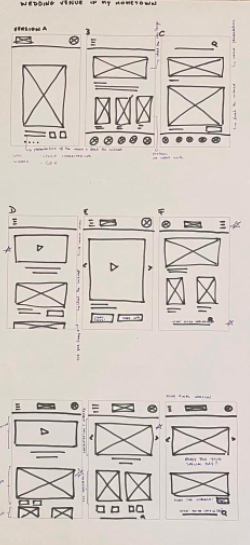
Taking the time to draft iterations of each screen of the app on paper ensured that the elements that made it to digital wireframes would be well-suited to address user pain points. It also made it easier to iterate quickly on those initial wireframes.
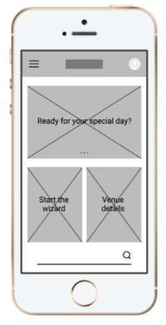
As I moved the paper wireframes to digital versions, I made sure to further refine these and make sure they met accessibility standards as well as ended up representing the useful product I wanted to build for users.
Easy navigation was a key user need to address in the wireframing in addition to equipping the app to work with assistive and accessible technologies.
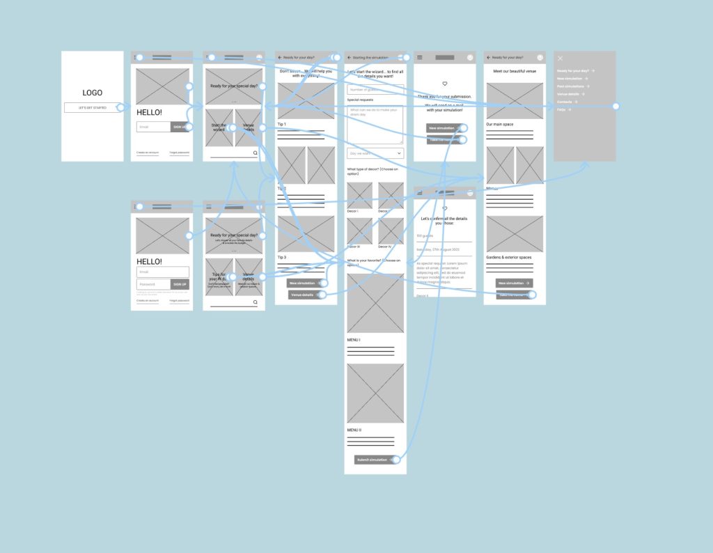
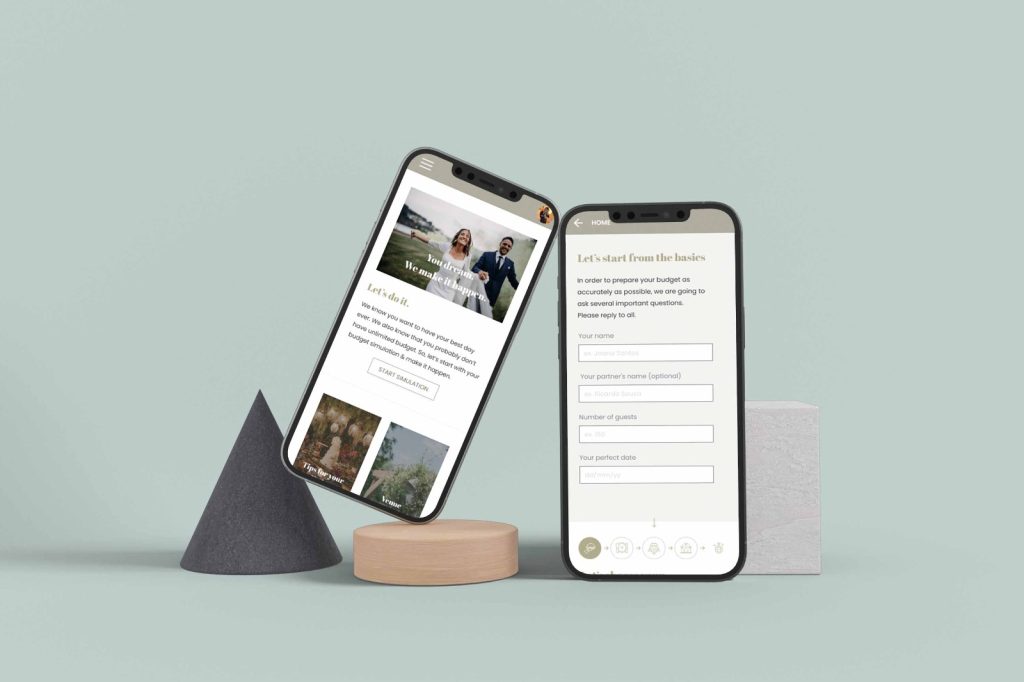
Using the completed set of digital wireframes, I created a low-fidelity prototype. The primary user flow I connected was consult details / tips and the quizz/wizard to simulate a wedding budget so the prototype could be used in a usability study.
Initial Design Concepts
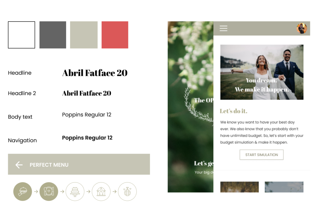
I explored a bunch of options trying to come up with an ideal design concept. I knew I wanted something that evoked luxury and had a bit of a vintage look to it, so I ended up selecting (after a few screen tests) the Abril Fatface font for the headings, while keeping legibility high with Poppins in the body.
I kept the color scheme simple with just a few highlighting colors when needed and otherwise very pastel-driven. I knew imagery would be important as the app needed to feel personal and thus although I did use a bit of iconography (later in the project) i chose images as a key component to drive messages to users.
User Tests
I took an audience of 7 people and extensively surveyed them to understand their take on the design and a few things I could do to improve the app’s look or it’s usability. A few finding came directly as a result of this with many more being a by-product of it:
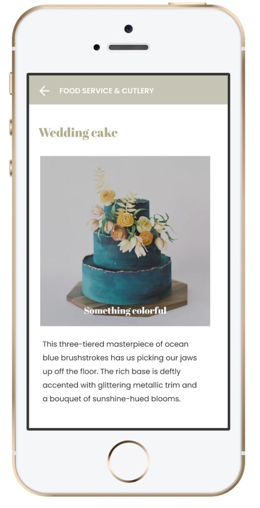
- I slightly change the color to make more contrast, so people with color disabilities can read.
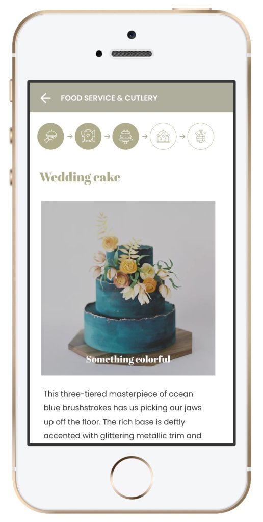
- I decided to create a visual identification of the steps in the simulator so users know where they are. That way, they always know how many steps are left and don’t get frustrated.
Mockups and Prototype
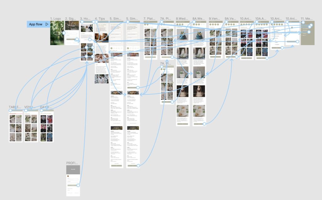
After adjustments to the screen design based on user feedback, I ended up creating a high-fidelity prototype that was changed a bunch of times until it presented cleaner user flows for building a wedding budget simulation, and lots of tips. This final prototype tried to simulate the yet-to-be-built app with the appropriate flows, actions and navigation, further enhancing the experience of those trying the app and in the future improving the handoff to engineering.
Conclusion
Impact:
The app makes users feel like OPO Palace really thinks about how to meet their needs.
One quote from peer feedback:
“The app made it so easy and fun to choose all the little things… I would definitely use this app for my wedding and recommend to my friends, really love the tips and how easy it is to plan my big day!”
While designing the OPO Palace app, I learned that what I think is the best design solution, sometime is not. Users feedback opened my mind and give me the opportunity to create new ideas.
